

AI Product Photos That Convert: Repeatable Image Workflow
Picture-Perfect Products That Sell: A Digital Guide to High‑Converting Product Images
Shoppers decide in seconds, and product images often do the heavy lifting. This digital guide focuses on creating polished, consistent, conversion-ready visuals using AI-assisted image generation and editing workflows—without needing a studio. The goal isn’t “perfectly artistic” photos; it’s repeatable scenes, reliable lighting, accurate angles, and backgrounds that match your brand and meet marketplace requirements.
What makes product images convert
Clarity beats everything else
Sharp focus, readable labels, and accurate color reduce hesitation and cut down on avoidable returns. If customers can’t confirm what they’re buying at a glance (finish, size, or key details), they’ll either bounce or order with uncertainty.
Consistency across the catalog builds trust
A unified look—similar framing, lighting mood, and background style—signals quality. Even budget-friendly products feel more premium when the catalog looks intentional instead of random.
Context that sells (without the clutter)
Context should answer practical questions: How big is it? Where does it live? What problem does it solve? Use just enough environment or lifestyle cues to communicate use-case and scale, but keep the product as the focal point.
Decision support images remove friction
Close-ups of materials, texture, controls, or ingredients help shoppers “verify” quality. A “what’s included” shot prevents confusion and reduces customer support messages.
A repeatable AI-assisted workflow for studio-level results
1) Start with a product checklist
Before making any images, list what must be visually true: materials, finish (matte vs. glossy), colorways, dimensions, and the top three benefits that can be shown—not told (grip texture, compartment layout, application consistency, etc.).
2) Choose a scene recipe
Lock a simple recipe that can be reused: background type (seamless, lifestyle, or textured), light direction, lens feel (macro vs. standard), and camera angle (front-on, 3/4, top-down). This becomes your “default setting” for fast, consistent production.
3) Generate variations quickly—then curate hard
Create multiple compositions for each product: hero, angle variation, detail close-up, scale cue, in-use lifestyle, and what’s included. Don’t publish all options—select a tight set where every image answers a buying question.
4) Polish for accuracy
Run a final pass for color cast, artifacts, and brand details. Verify logos and labels, clean up edges, and make sure typography (on packaging, bottles, tags) is readable and not distorted.
5) Export to platform specs
Keep a high-resolution master, then export crops sized for the places shoppers see first: square for thumbnails, 4:5 for mobile feeds, and larger files for zoom. Marketplace rules vary, so confirm requirements before publishing; Google Merchant Center and Amazon provide detailed image guidelines.
Scene recipes that fit common product categories
Beauty and skincare
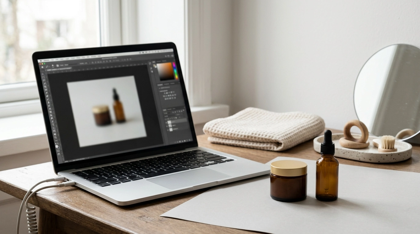
Use soft, diffused light and a clean bathroom or vanity vibe. If texture matters (balms, serums, foundation), add a controlled swatch shot that looks hygienic and true-to-life.
Jewelry and accessories
Go for a tight macro feel with controlled reflections. Neutral gradients, clean shadows, and careful highlight placement make metals and stones look expensive without looking “over-edited.”
Home goods
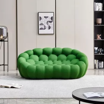
A natural window-light look tends to feel trustworthy. Use realistic room styling, but keep it minimal—buyers should see the product’s shape, scale, and finish instantly.
Food and supplements
Prioritize label readability and appetizing highlights. Keep clutter low around claims or ingredients so the product is the authority, not the styling.
Digital products
Use mockups that show the deliverable clearly (screens, pages, modules) and maintain a cohesive palette that matches your brand. The goal is instant comprehension: what it is, what it contains, and what the buyer can do with it.
| Image type | What it should show | Common mistakes to avoid |
|---|---|---|
| Hero image | Full product, centered, clear silhouette | Busy background, warped proportions, clipped edges |
| Angle variation | 3/4 view or side profile for depth | Inconsistent lighting between angles |
| Detail close-up | Texture, stitching, controls, ingredients, or finish | Over-sharpening, fake-looking surfaces |
| Scale cue | Hand-held, on-body, or next to a familiar object | Misleading scale, awkward cropping |
| In-use lifestyle | Product solving a real scenario | Too many props, product not the focal point |
| What’s included | Packaging, accessories, components | Missing items, confusing arrangement |
Lighting, shadows, and reflections that look natural
Backgrounds and styling that protect brand identity
Marketplace-ready image requirements and quality checks
Helpful references include Google Merchant Center image requirements, Amazon Seller Central product image requirements, and Shopify’s overview of product photography tips.
Using the digital guide to produce images faster without sacrificing quality
Recommended digital downloads for faster, cleaner visuals
- Picture-Perfect Products That Sell (Digital Guide) — A structured system for creating consistent product scenes, angles, and polished listing-ready sets.
- AI Tools for Professional Editing Guide (Digital Download) — Practical workflows for refining visuals and improving production efficiency across creative tasks.
FAQ
Will AI-generated product images look realistic enough for customers to trust?
Yes—when lighting direction is consistent, shadows are believable, proportions are accurate, and artifacts are removed in a careful review. Always zoom in to check edges and text, validate color against references, and rely on real product photos when you need exact labeling or finishes.
How many images should a product listing include?
A strong practical range is 5–8 images: hero, alternate angle, detail close-up, scale cue, in-use lifestyle, and what’s included. Platform limits vary, so prioritize the shots that answer the biggest buying questions fastest.
What’s the fastest way to keep a whole catalog visually consistent?
Standardize a small set of scene recipes, crops, and lighting rules, then batch production by image type. Maintain a simple checklist and a reference board for backgrounds and tones so every new product matches the same visual system.










Leave a comment